The new Analytics Module
The new Analytics module, the subject of discussions and presentations at every community meeting for over 2 years, will soon be released. To whet your appetite, here’s a brief overview of how this module works.

Why a new module?
geOrchestra has long had an analytics module whose purpose is to collect usage data from OGC services and provide graphical renderings: number of requests by map layers, by organization, by user.
The need to replace this module became apparent with the gradual replacement of the Security-proxy by the Gateway. Indeed, log collection was partly coded into the security proxy, and the Gateway is not meant to take over this role: current technologies make it possible to envision collection through more decoupled means.
The entire old analytics module has served well, for many years but now lacks flexibility: data visualizations are “hard-coded”,database tables as well, and usage analysis is strictly limited to OGC data. And even then, limited to WxS services (it does not cover the new OGC API standards).
Let’s not forget that tracking platform usage is at the heart of reporting needs, making it possible to justify the resources invested in technological tools, but also the time spent on a map, a visualization, or a dataset. Justify and therefore… fund. The more control you have over the data visualization, the more you can show in detail the impact of the time and resources invested.
It was therefore decided to consider a complete replacement of this module.
Since the community’s geOcom 2023, a working group has been focusing on the topic. The technical choices are indeed not obvious. Several presentations have taken place: geOcom 2023, geOcom 2024, geOcom 2025.
Late 2024, funding from the Hauts-de-France French region made it possible to launch the development of this new module, complemented by funding from the MEL for OGC API Feature coverage (currently underway).
A new module… that does the same thing!
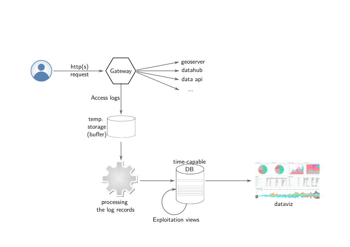
Yes indeed. In its current state, it does roughly the same thing:
- the Gateway exposes its access logs,
- these access logs are collected and stored in a database,
- they are then processed to extract relevant information and, for now, only process OGC usage. The result is stored in the form of tables and views in the database,
- a data visualization offers charts displaying: number of requests by map layers, by organization, by user ;o). I’m exaggerating a bit: there are a few more.
Yes, but then, what’s the point?
OK, let’s go back over the list above to highlight a few differences:
- the Gateway exposes its access logs via a standard, OpenTelemetry. In fact, any tool capable of exposing its access logs via OpenTelemetry can connect to the system.
- these access logs are collected via an “off-the-shelf” tool, Vector, and stored in a database.
- This tool is highly configurable, accepts multiple data sources, can transform them on the fly, even merge them. And its maintenance is not the responsibility of the geOrchestra project.
- the database used is optimized for large volumes of time-series data. It is TimescaleDB. TimescaleDB is a PostgreSQL extension that adds several key features for this optimization: data aggregation views at a given time step (views per hour, per day, per whatever you want) that are automatically updated, data retention management, compression, automatic partitioning. All of this is, of course, highly configurable.
- they are then processed to extract relevant information and, for now, only process OGC usage. The result is stored in the form of tables and views in the database.
- Data processing is in fact the only in-house tool. A Python CLI which, although it currently only covers OGC data, is designed to be easy to enrich with features to go beyond OGC usage. Python language, to be accessible to everyone.
- Here again and above all, we use the TimescaleDB database to optimize data visualization response times and the database’s ability to handle load over time.
- a data visualization in Apache Superset offers charts displaying: number of requests by map layers, by organization, by user ;o). I’m exaggerating a bit—there are a few more. And above all, you will be able to easily add your own charts, share them with the community, etc. I remind you that the integration of Apache Superset into geOrchestra was carried out in the first half of 2025 and presented at geOcom 2025. Here again, we are using an “off-the-shelf” component, or almost. And in fact, you are free to build your data visualization with another tool if you don’t like Superset.
The key notion here is therefore flexibility. We have also chosen to rely as much as possible on existing standards and tools, in the spirit of the geOrchestra project, with the idea of interoperability, but also with the goal of limiting software maintenance costs over time.
The counterpart of this choice is that, for all these components to work together as expected, they must be meticulously assembled and configured. The repository of the new analytics module and the accompanying documentation will provide you with standard values, but since each platform has its own specificities, it will likely be necessary to check each step during setup and configuration.
I have worked a lot on the documentation, which I hope is sufficiently exhaustive, but it will need to be read carefully.
There is no doubt that this new module will be widely discussed and probably amended at the community winter meeting in two months’ time.
Jean, for the geOrchestra project